Reference — lookup information.
Overview
- How to create Salesforce reports using Affinity’s premade templates
- How to create Salesforce reports from scratch using Affinity Data and synced Email and Meeting Activity data
- Examples of reports you can create using Affinity Data
- Average Relationship Score Trend
- Percentage of Relationship Score Sums by Industry
How to create Salesforce reports using Affinity’s premade templates
Use Affinity’s premade templates as a starting point for how you/your team can use relationship-focused insights to improve performance and drive more revenue.- Once the Salesforce admin on your account has updated to Affinity for Salesforce’s latest managed package, you can get started with Affinity’s premade templates by clicking on Dashboards > All Folders > Affinity Intel Dashboards 1.0.
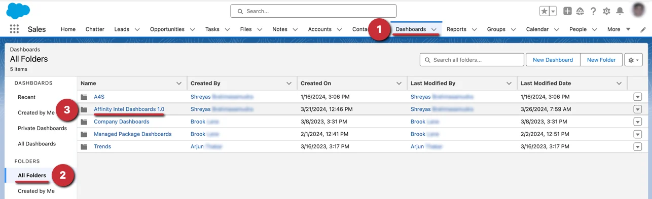
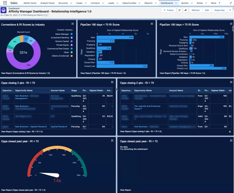
- Then, select the dashboard that you’d like to access based on your role:

- End User
- Manager
- Now, you will see a dashboard with reports already made for you to dive into and/or edit accordingly.
How to create Salesforce reports from scratch using Affinity Data and synced Email and Meeting Activity data
In addition to Affinity’s pre-made templates, you can create custom reports from scratch or edit existing reports with Affinity’s data in the following ways:- Use the Affinity Data fields that are being pulled into your custom Salesforce fields (required) for Account and Contact objects.
- Use the Email and Meeting Activity data that Affinity natively syncs into Salesforce.
- Learn more about creating reports catered to dealflow analysis in this article: How to build a dealmaker dashboard in Salesforce using Affinity data
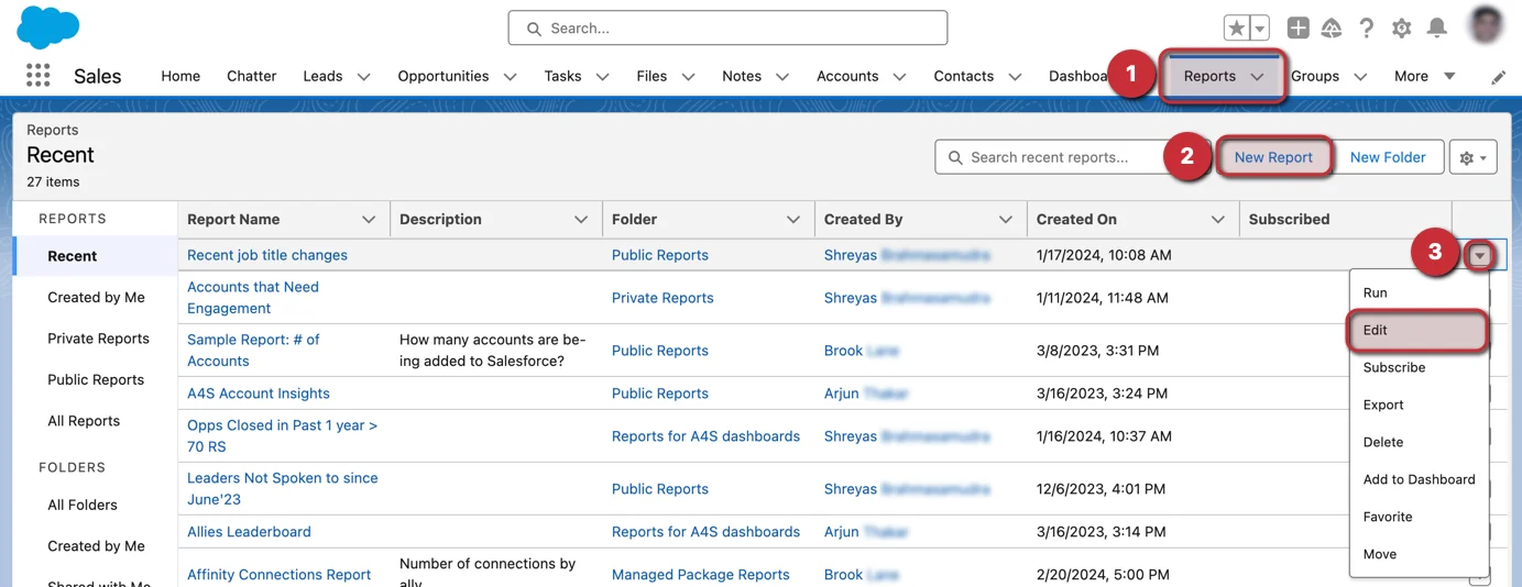
- To create a new report or edit an existing report, click on the Reports tab.
- From here, click on New Report to start a new report from scratch.
- Otherwise, you can click the dropdown arrow next to an existing report that you’d like to Edit and start adding/replacing fields with the relevant Affinity Data fields or Email and Meeting Activity Data.
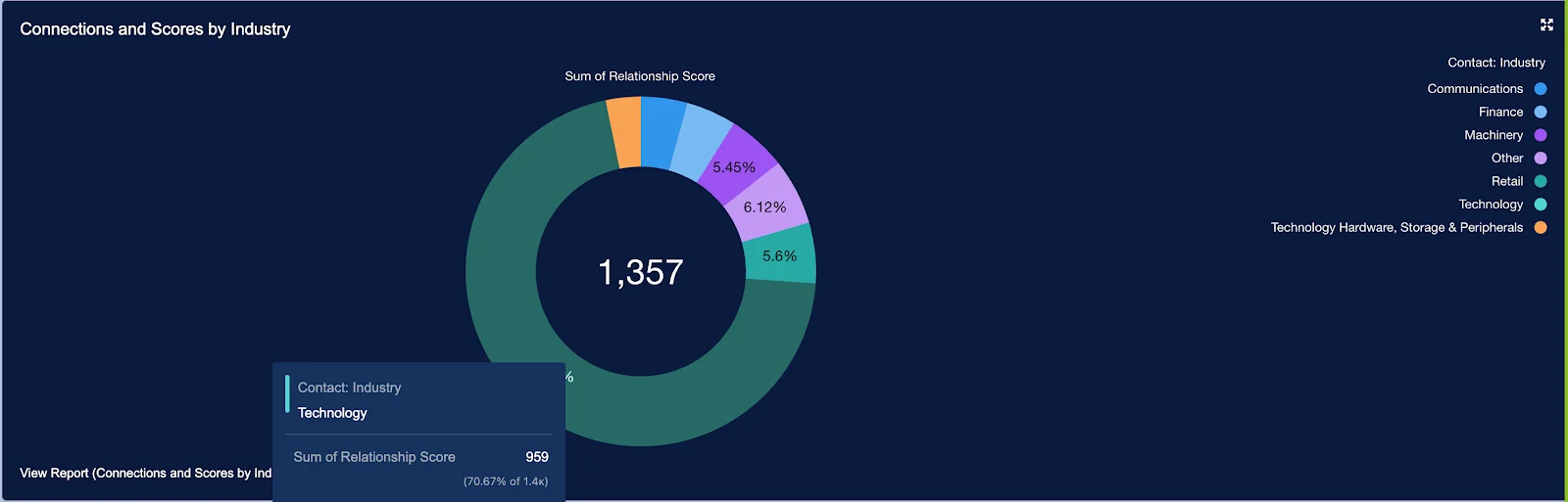
Examples of reports you can create using Affinity Data
Average Relationship Score Trend
You can create a visualization that tracks the Average Relationship Score Trend, which can help you and your team understand if you’re prioritizing the accounts and contacts you haven’t been in frequent contact with over time.Percentage of Relationship Score Sums by Industry
You can create a visualization that shows the Percentage of Relationship Score Sums by Industry. This will show you which industries you and your team members communicate with the most frequently.