Reference — lookup information.
How to create a List Summary Report using the template
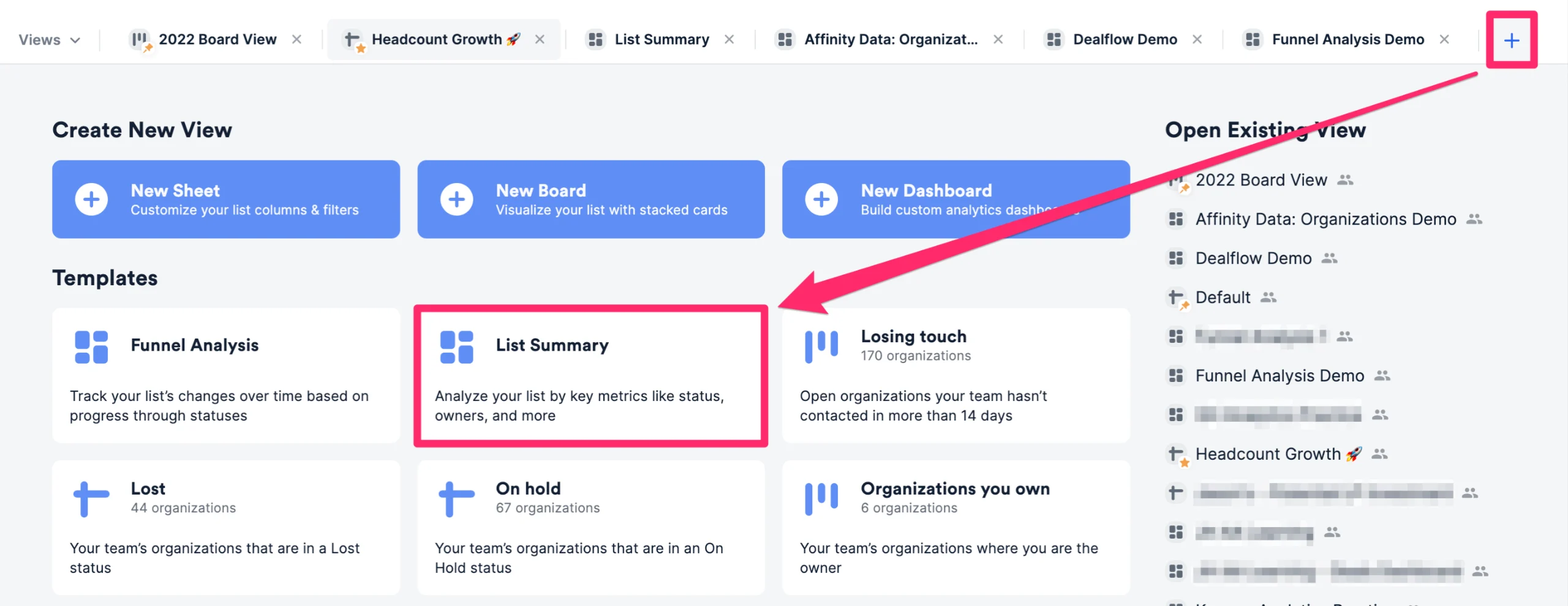
- First, click into the list you’d like to report on, then click the + icon as shown below. Then, click the List Summary template option to create a new dashboard view.
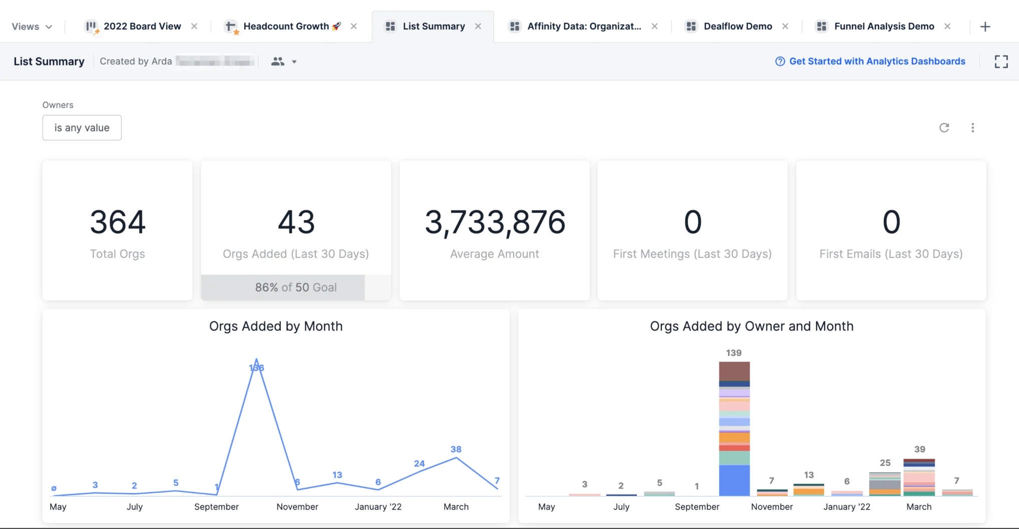
- Once the List Summary report is generated, you will immediately see different visualization tiles and metrics based on the data within this list.
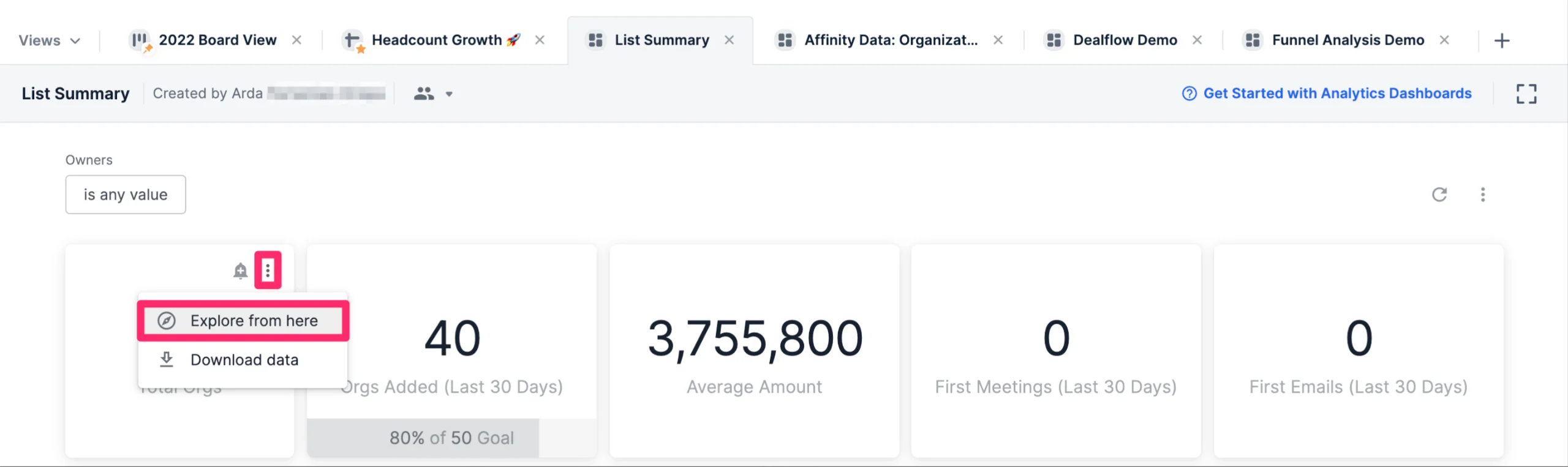
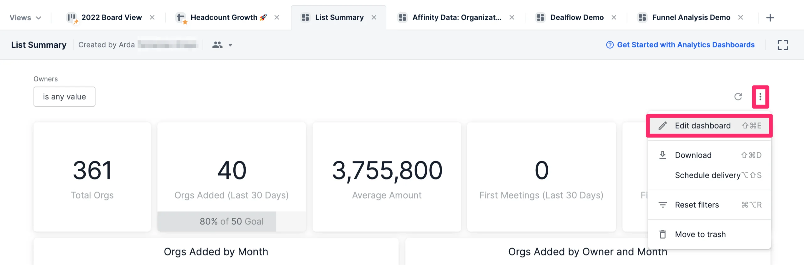
- Want to understand how certain visualization tiles were generated? Click the ellipsis (3-dotted icon) on the top-right corner of the visualization tile you want to dig deeper into, then click Explore from here.
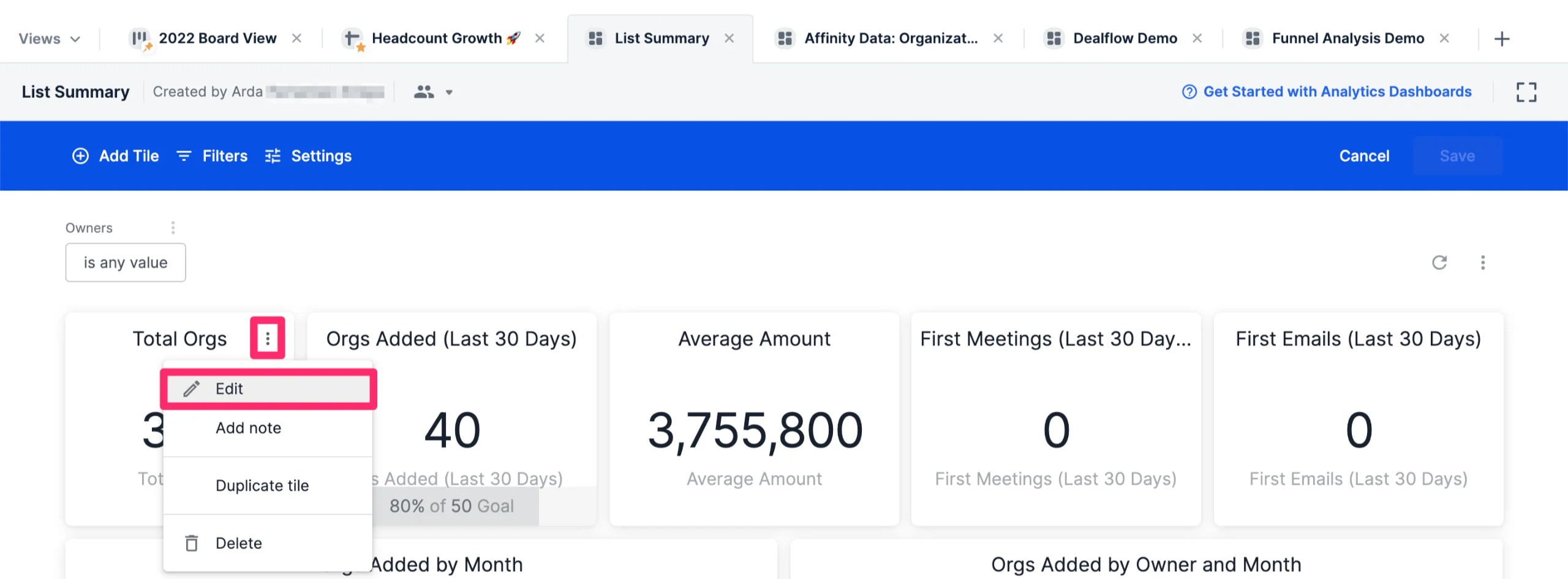
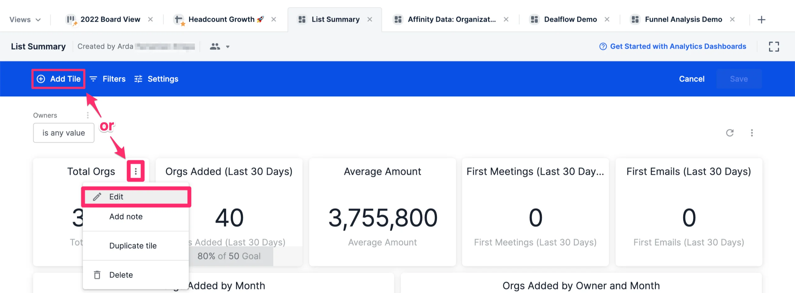
- If you’d like to change the data fields being used for certain visualization tiles, click the ellipsis (3-dotted icon) on the top-right corner, then click Edit dashboard.

- Then, click the ellipsis (3-dotted icon) on the top-right corner of the visualization tile you want to dig deeper into, then click Edit.
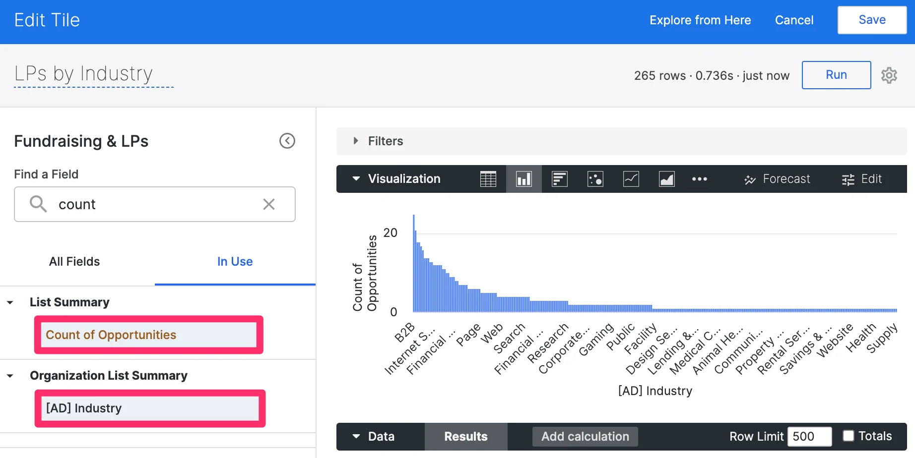
How to use organization-based fields in your reports for opportunity lists
- For those using opportunity lists and would like to use organization-based fields in their reports, click Edit dashboard.
- Then, create a new visualization tile or click the ellipsis (3-dotted icon) within an existing visualization tile you’d like to change, then click Edit.
- On the left-side, click on the All Fields tab. You’ll notice the organization-based fields under the section titled Organization List Summary.
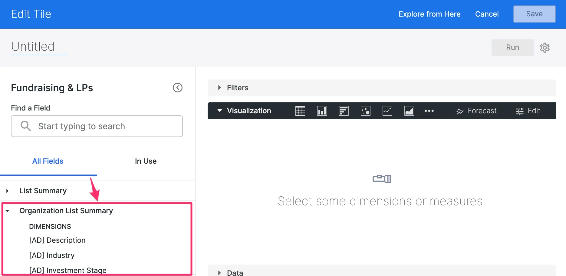
- You can start using these fields to modify your visualization tiles and include organization-based data based on the organization that’s associated with the opportunity. For example, you can now identify the Count of Opportunities based on Affinity Data’s Industry field for organizations.